

2D + 3D DESIGN
This page highlights my graphic design for visual communication and applied functional craft. My early design education began with analog tools and processes such as darkroom film processing, mechanical drafting with french curves, hand lettering with Rapidograph pens, airbrushing, precise cutting of amberlith and preparing wax paste-ups, offset printing, silkscreen printing, and drypress mounting. I quickly transitioned to a mostly digital workflow for desktop publishing related design work. The speed of creating variations of a concept and empowerment to alter imagery with the option of undoing a step was undeniable, but the shift of working with a keyboard and mouse while staring at a screen for hours at a time had drawbacks. For me, there was a sense of loss to switch from using a variety tools that required hand-eye coordination and movement to a stationary tool where material and texture was only emulated. Now, as technology has evolved and I have accumulated additional skills, my tendency is to think about design more broadly, and in a way that can fuse digital tools with physical materials. This makes it harder to neatly summarize what I do, but being multi-disciplinary is both an asset for me as an individual and for clients. I am a holistic, creative thinker with experience that excels at attention-orientented technical work.
Album Cover Design
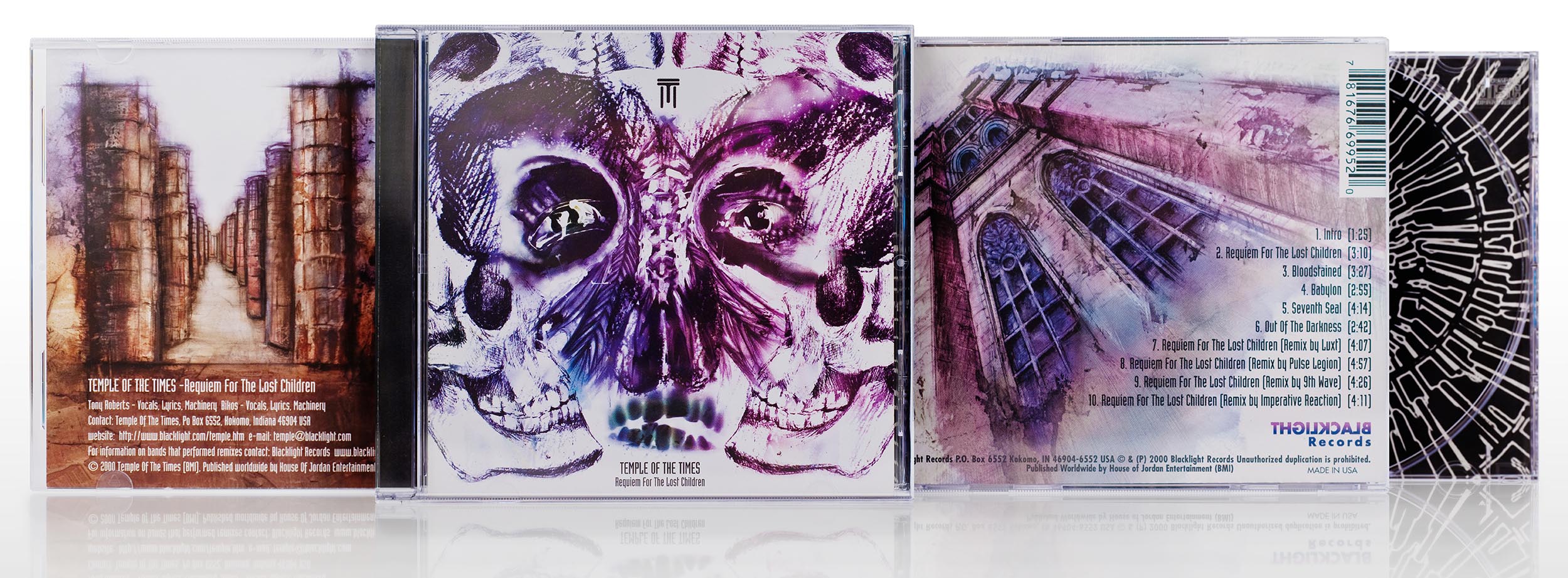
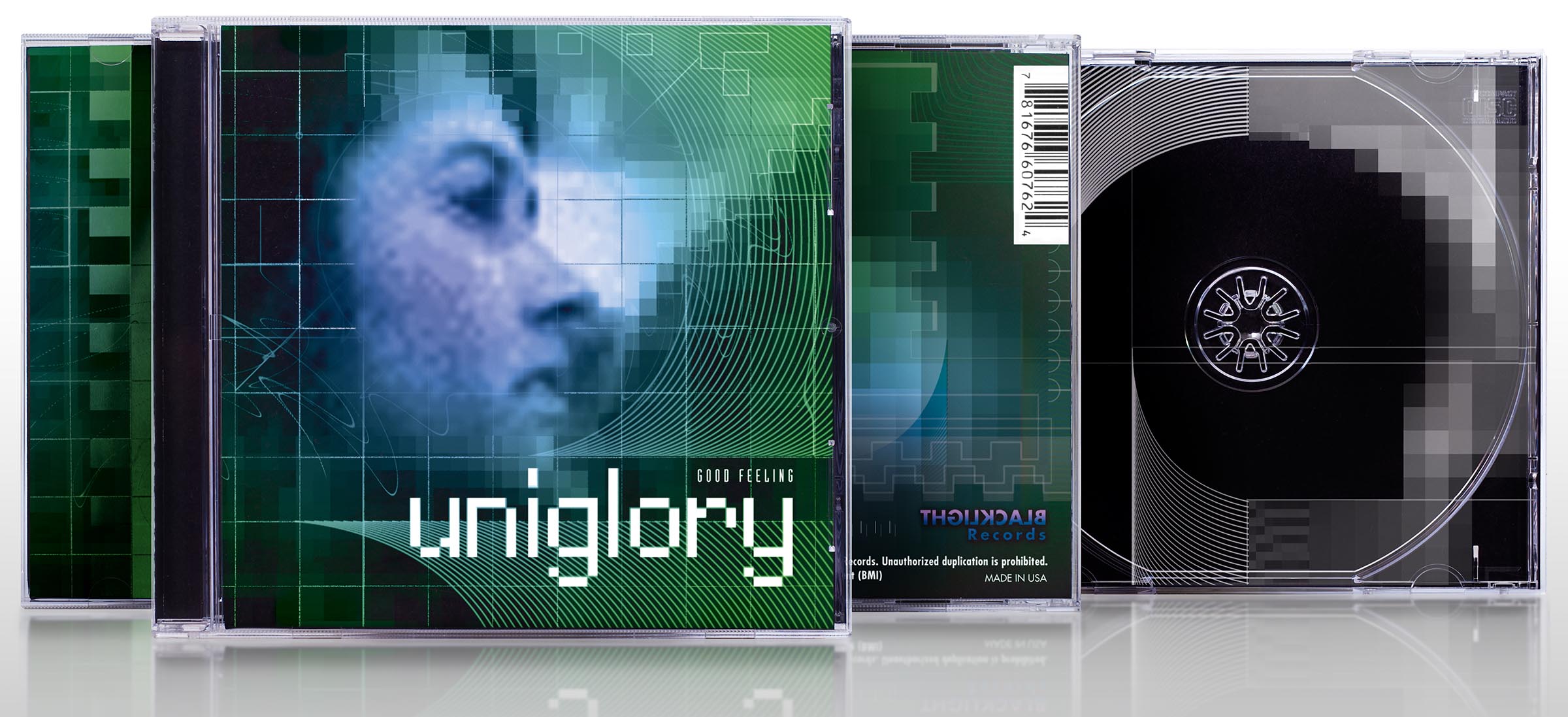
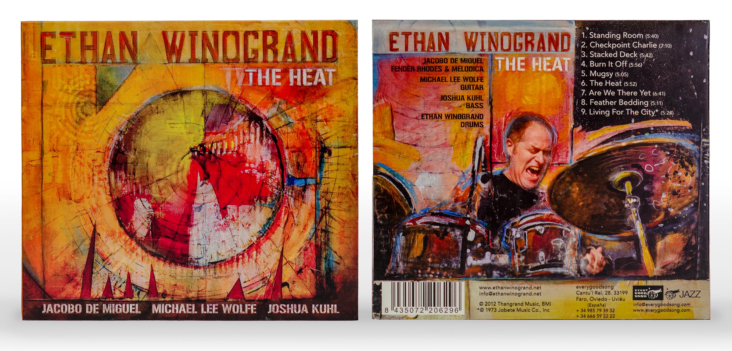
I have extensive experience designing album covers, promotional graphics, and file preperation for commerical printing. I have worked with a variety of record labels, bands, and solo acts. Genres include rock, pop, heavy metal, industrial, electronic, jazz, singer/songwriter, and folk/county. Unless otherwise noted in the captions, the examples below include my photography, illustration, design, and layout.
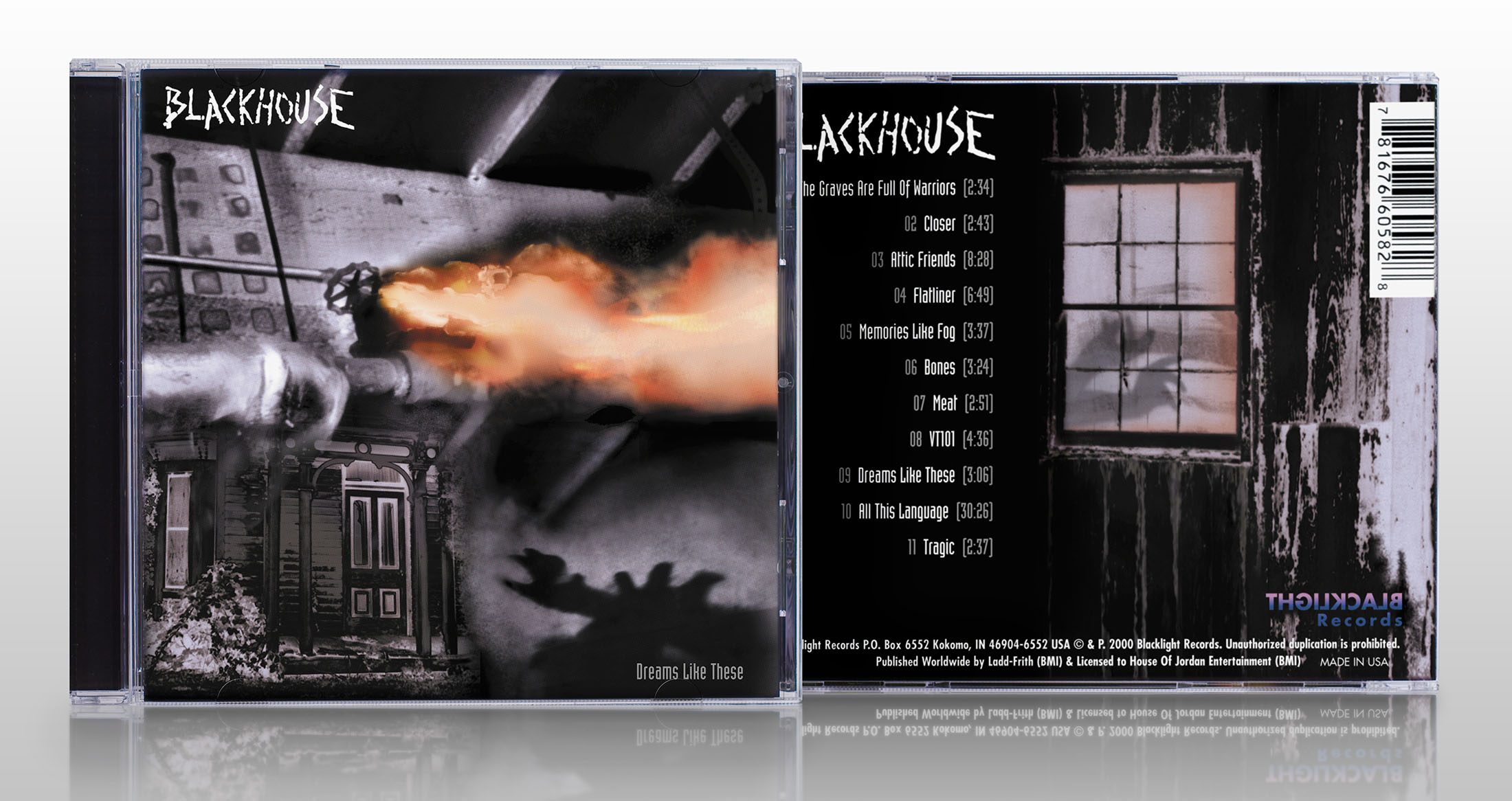
Photo-illustration and design by Matt Frantz
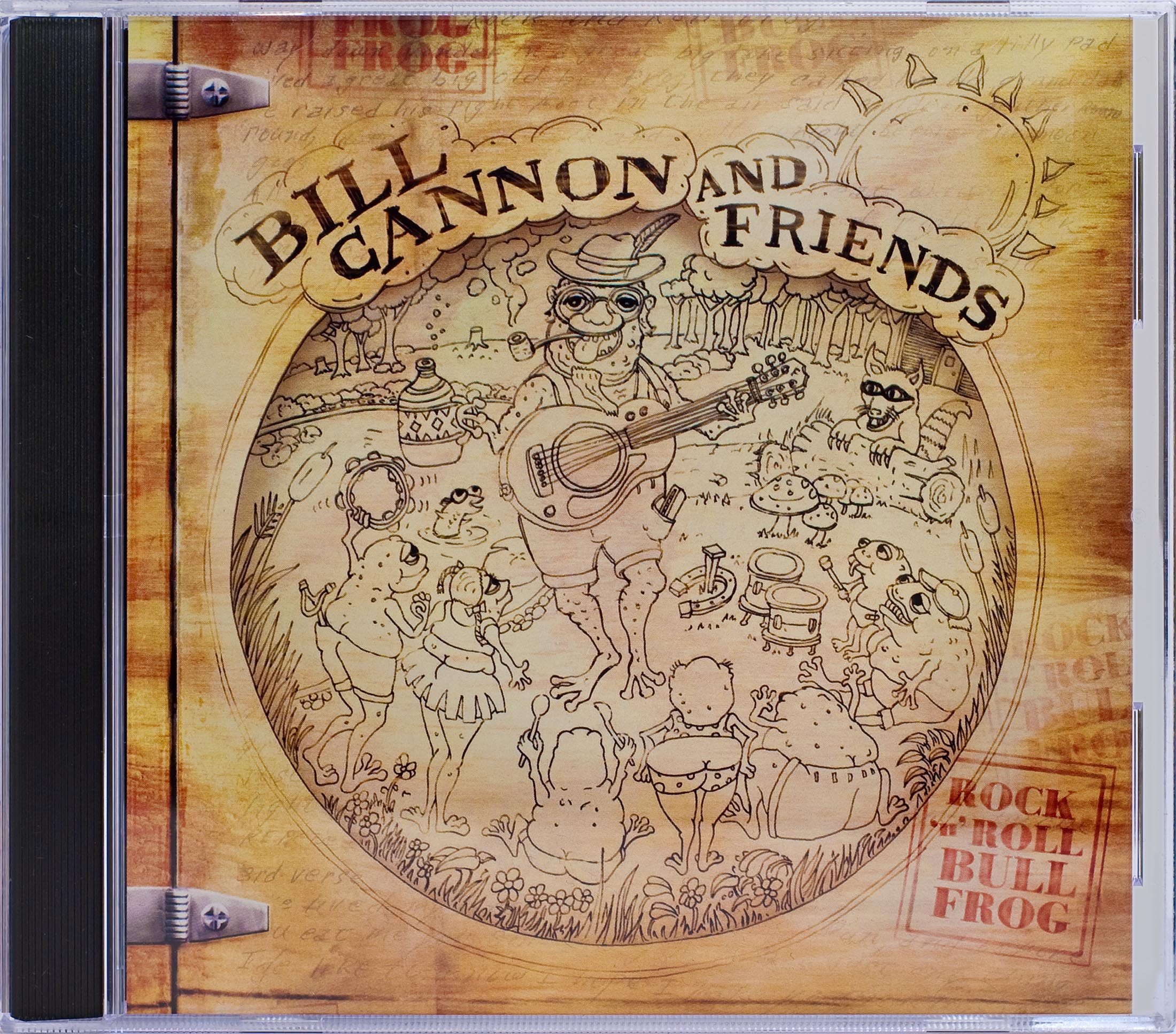
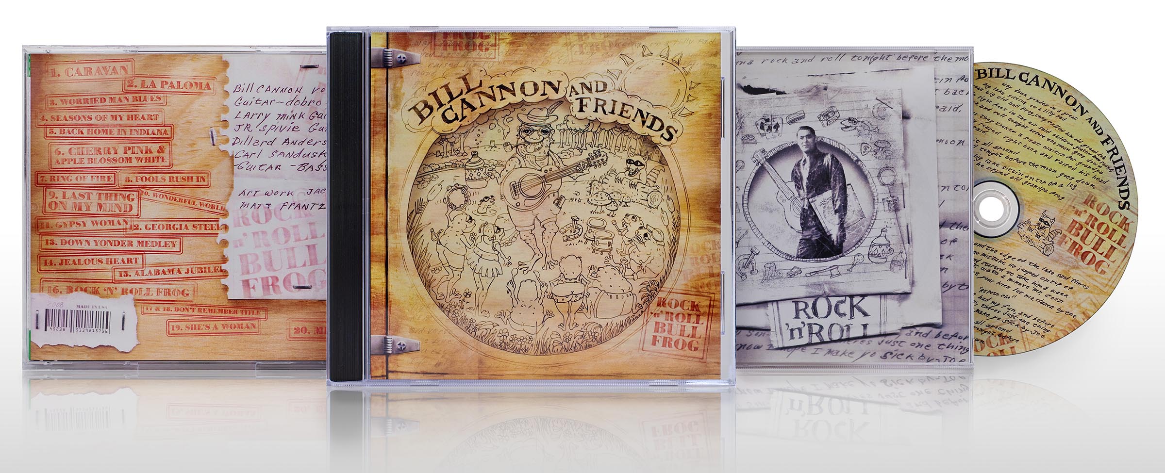
Design and illustration by Matt Frantz
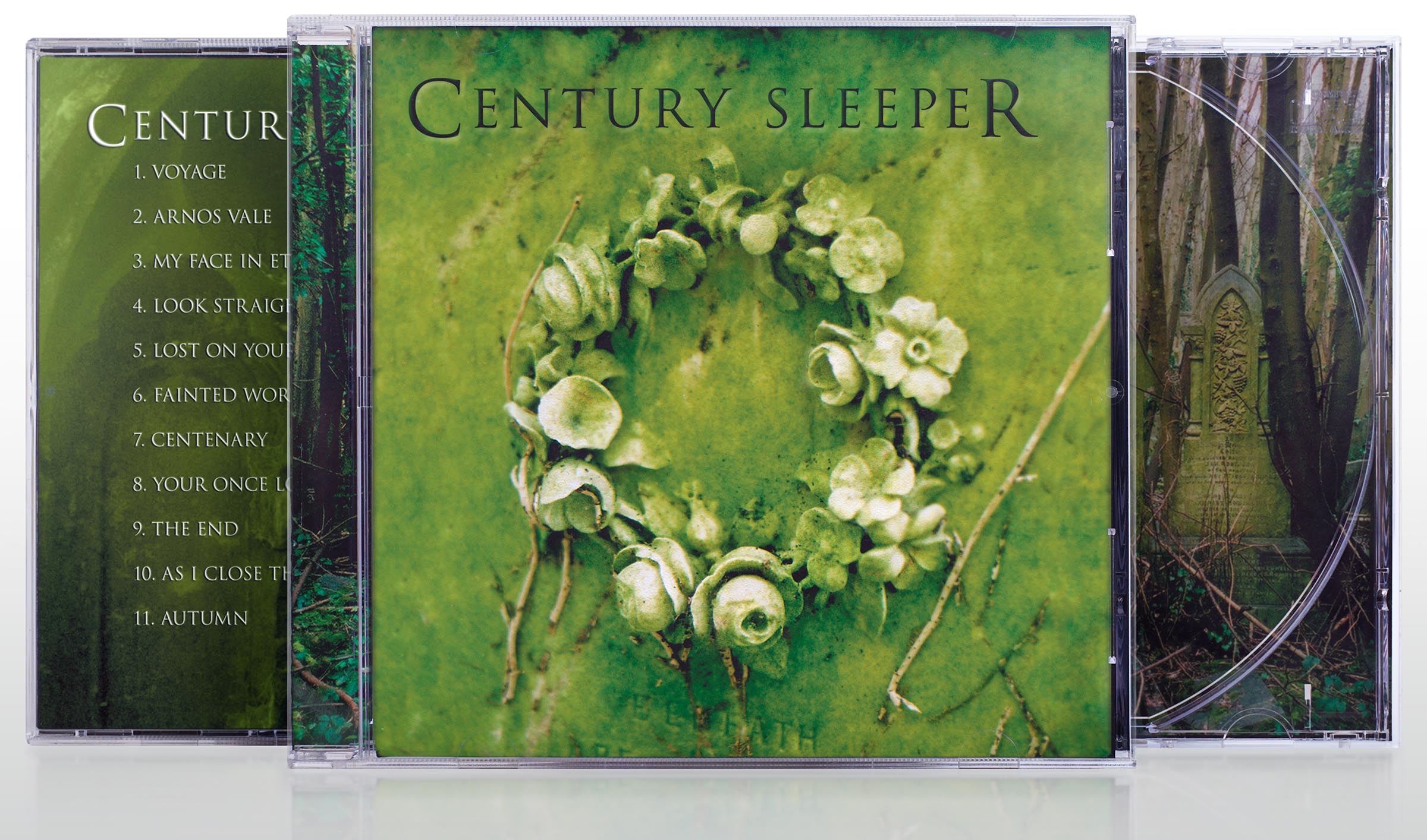
Design and illustration by Matt Frantz
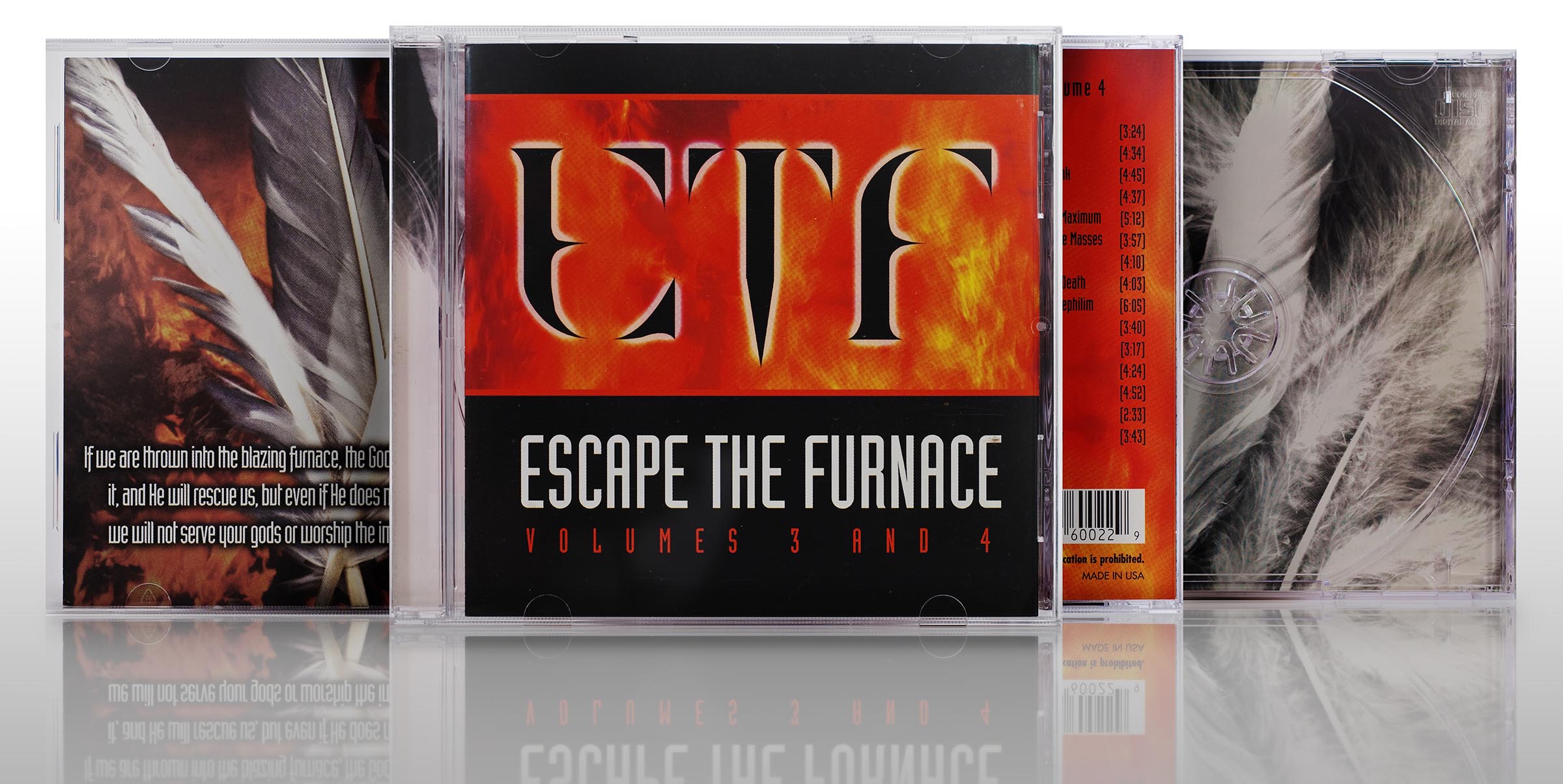
Design by Matt Frantz, Art Photos by lan Arkley, band photo by Katherine Hamilton.
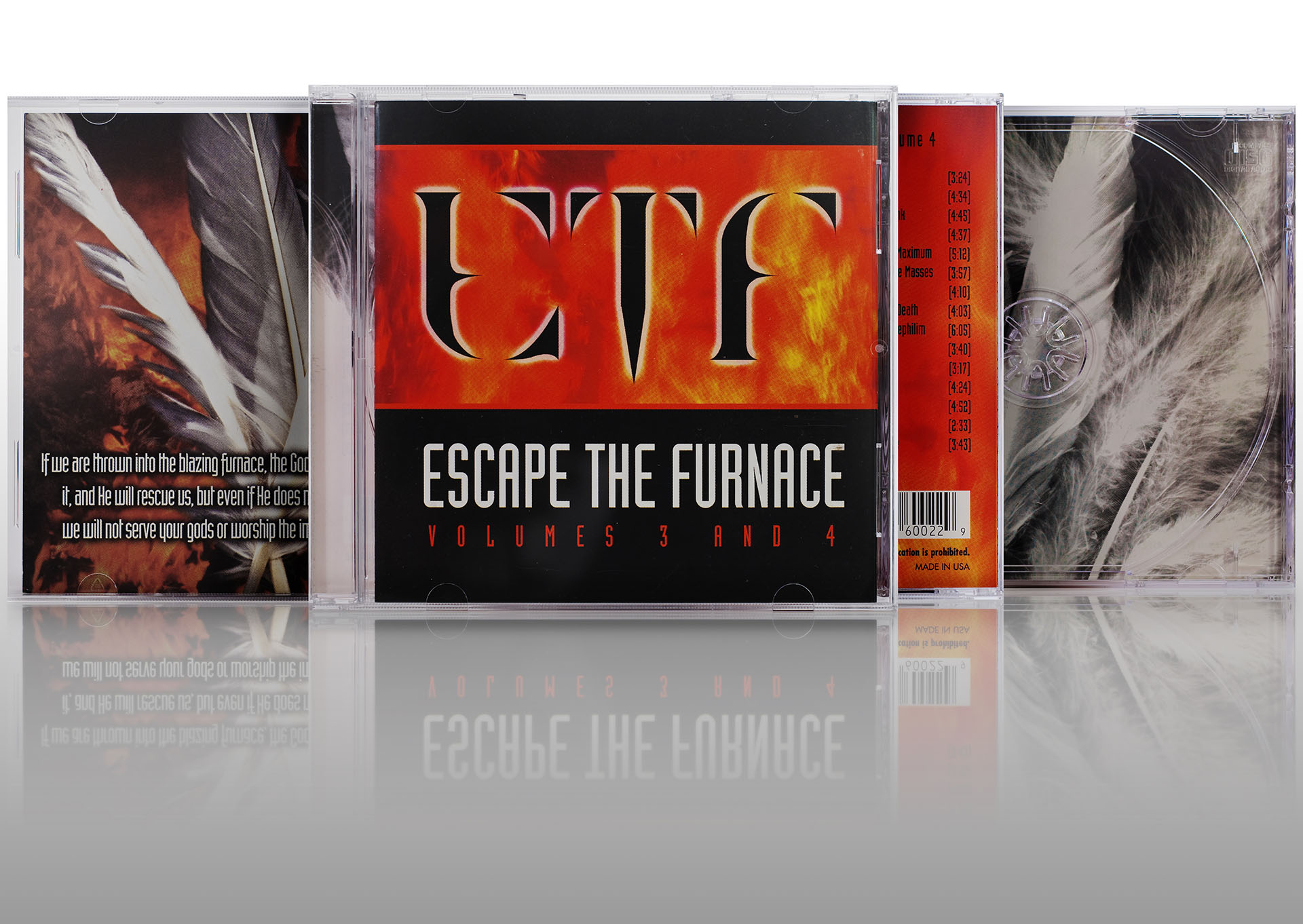
Escape the Furnace panels
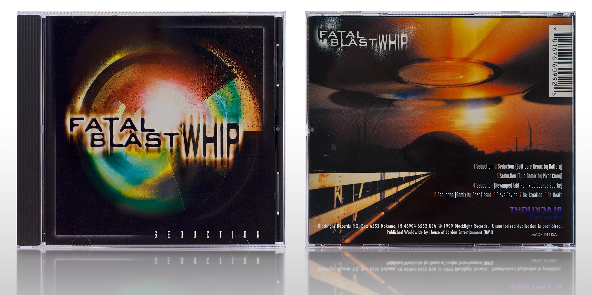
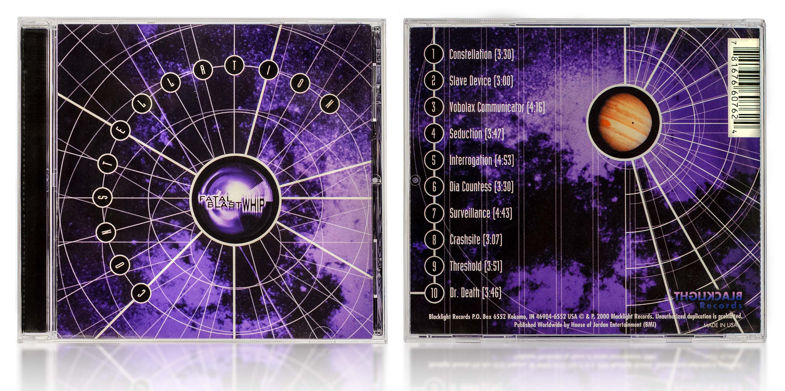
Fatal Blast Whip-Sseduction CD
Art and design by Matt Frantz
Turbo-laser logo and CD
Graphic design based around band supplied photo.
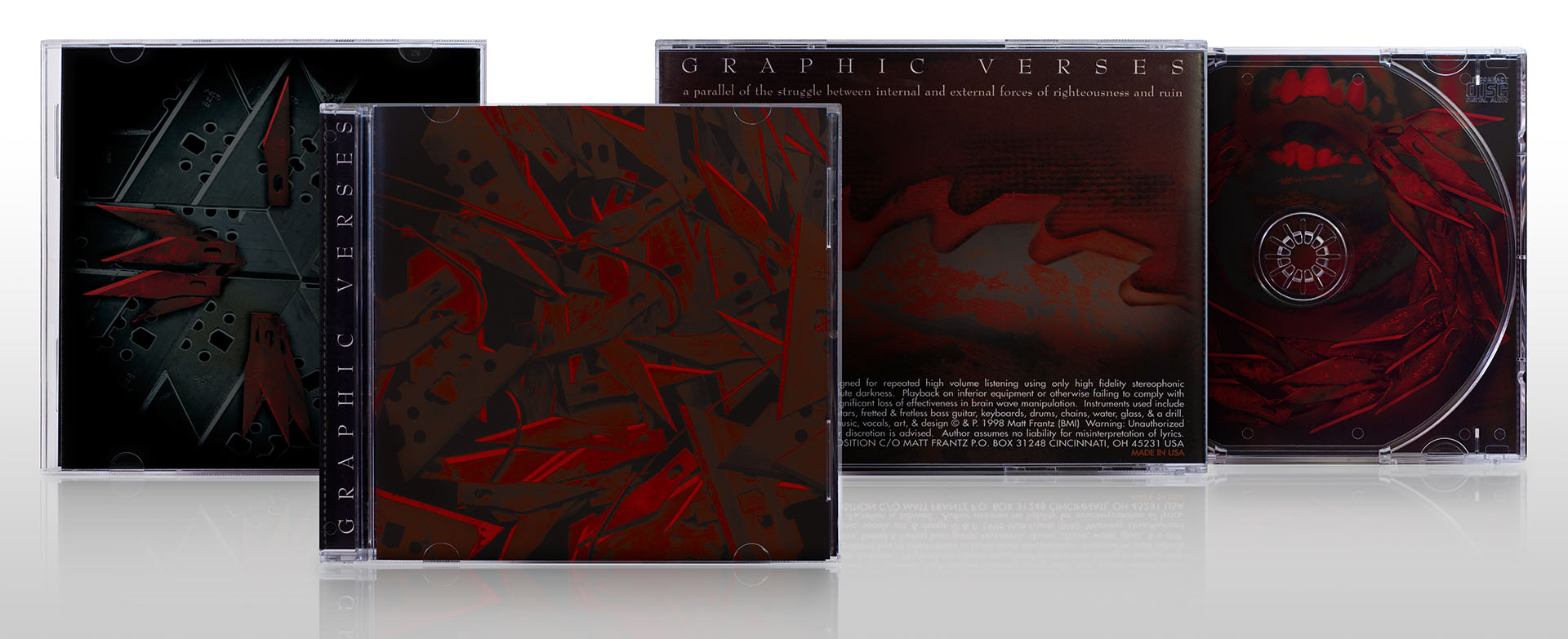
Graphic Verses panels
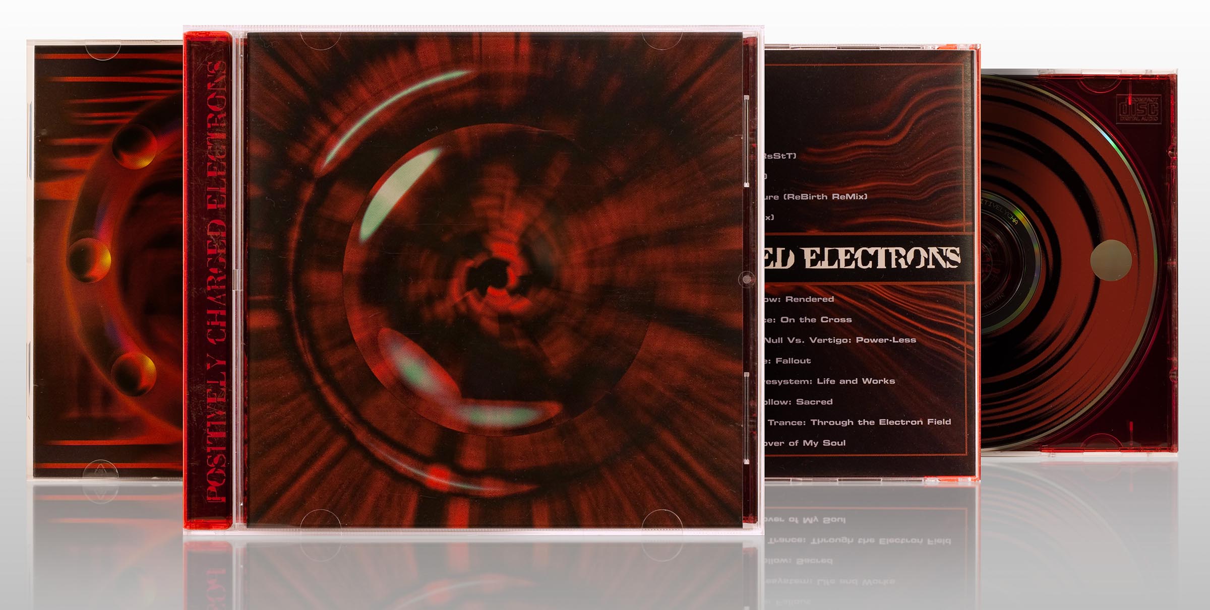
Positively Charged Electrons CD panels
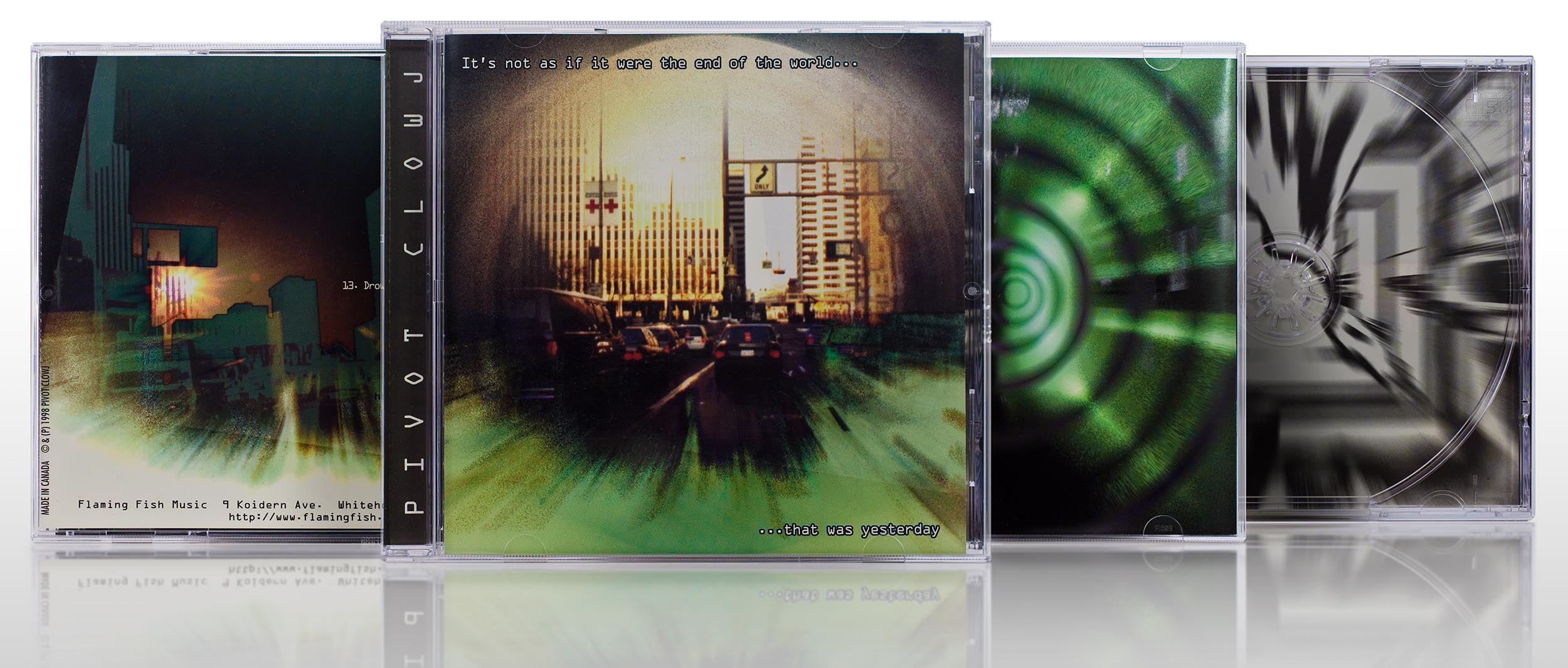
Photo and graphics by Matt Frantz.
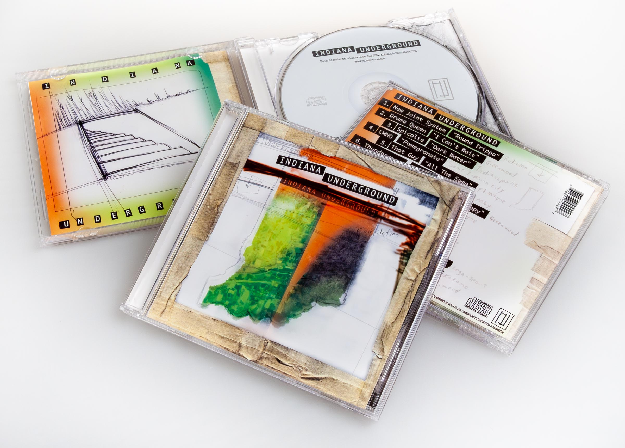
Indiana Underground package art + design by Matt Frantz
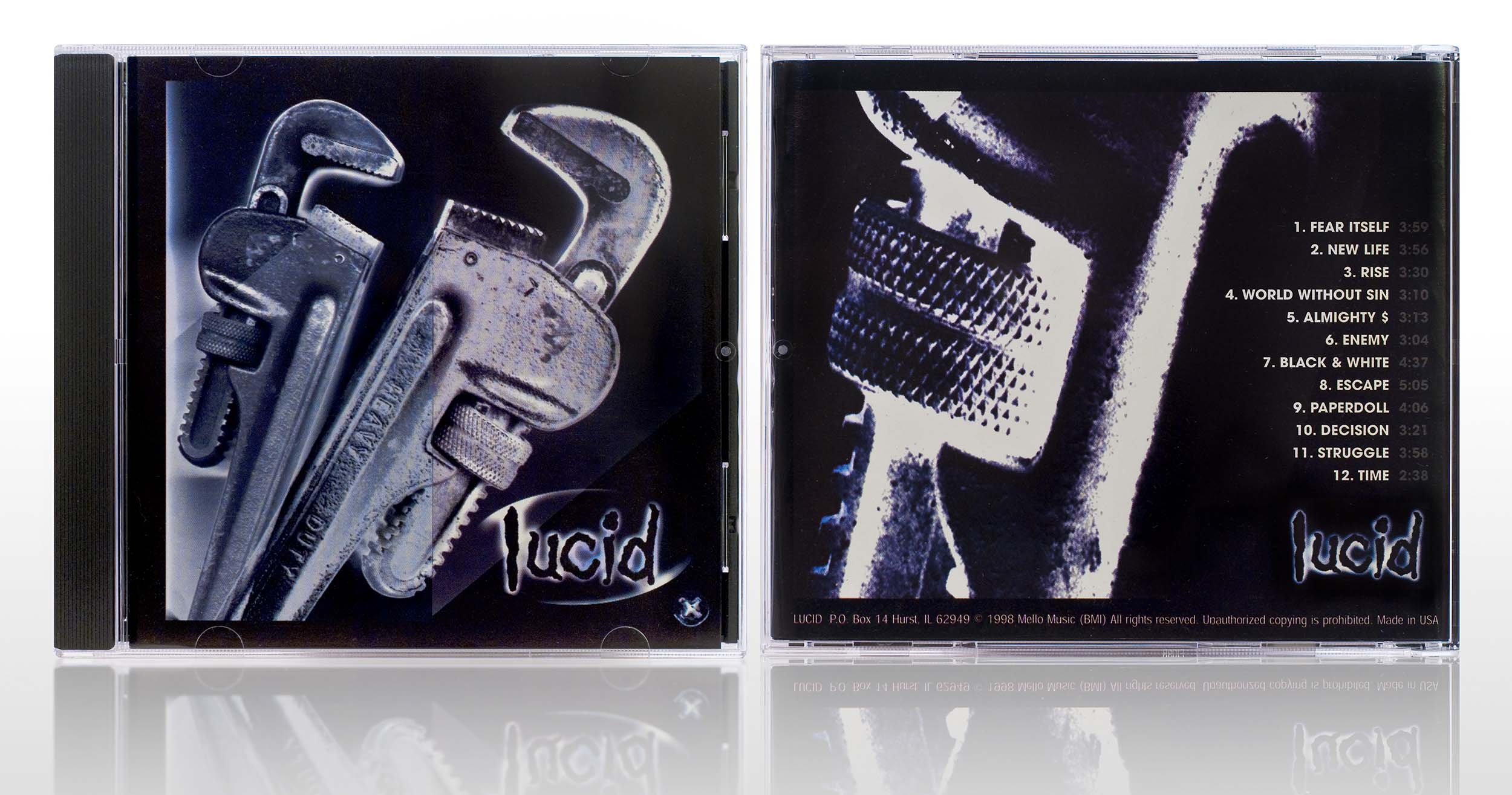
Lucid self-titled CD
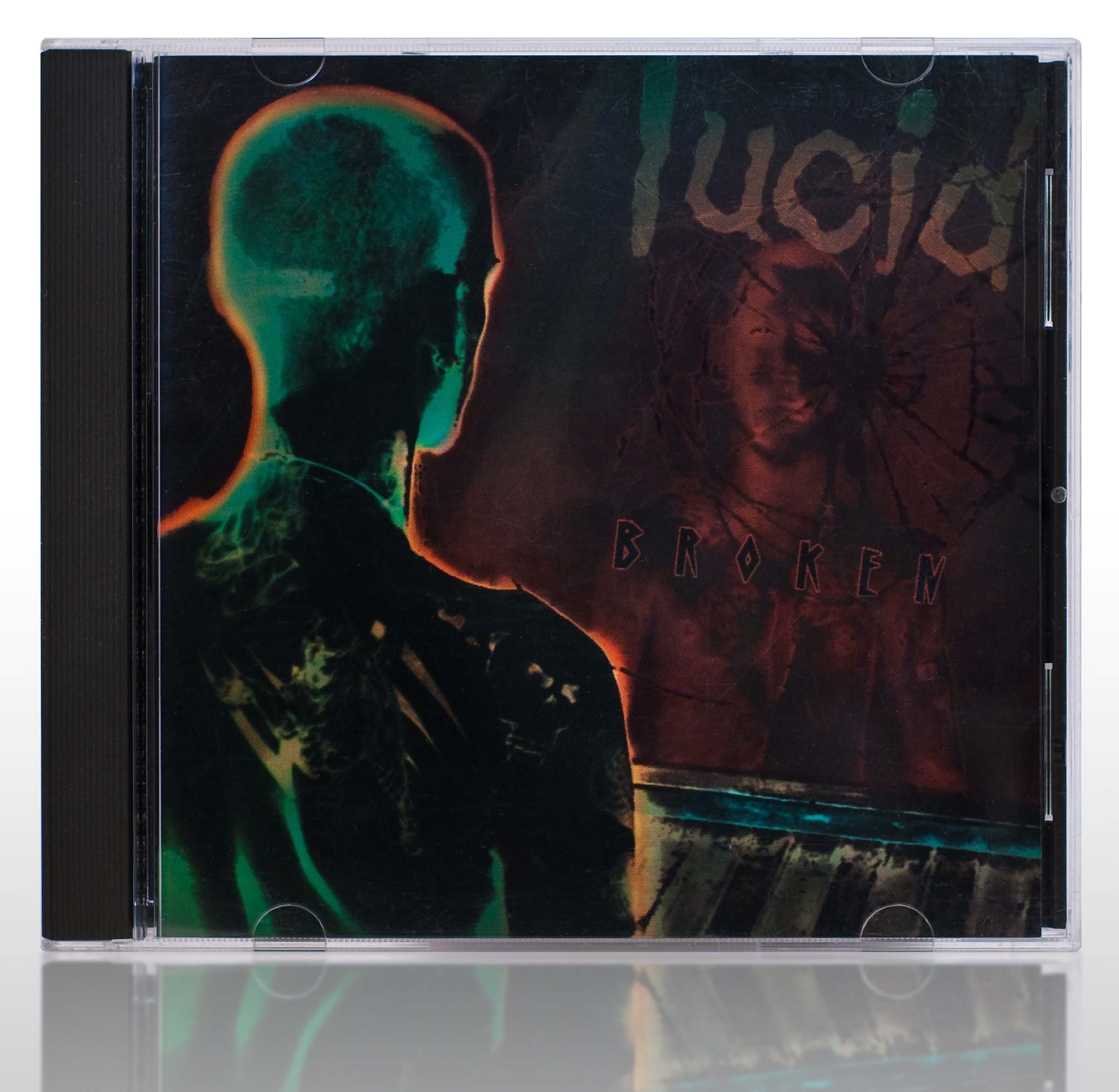
Photo-manipulation and design by Matt Frantz
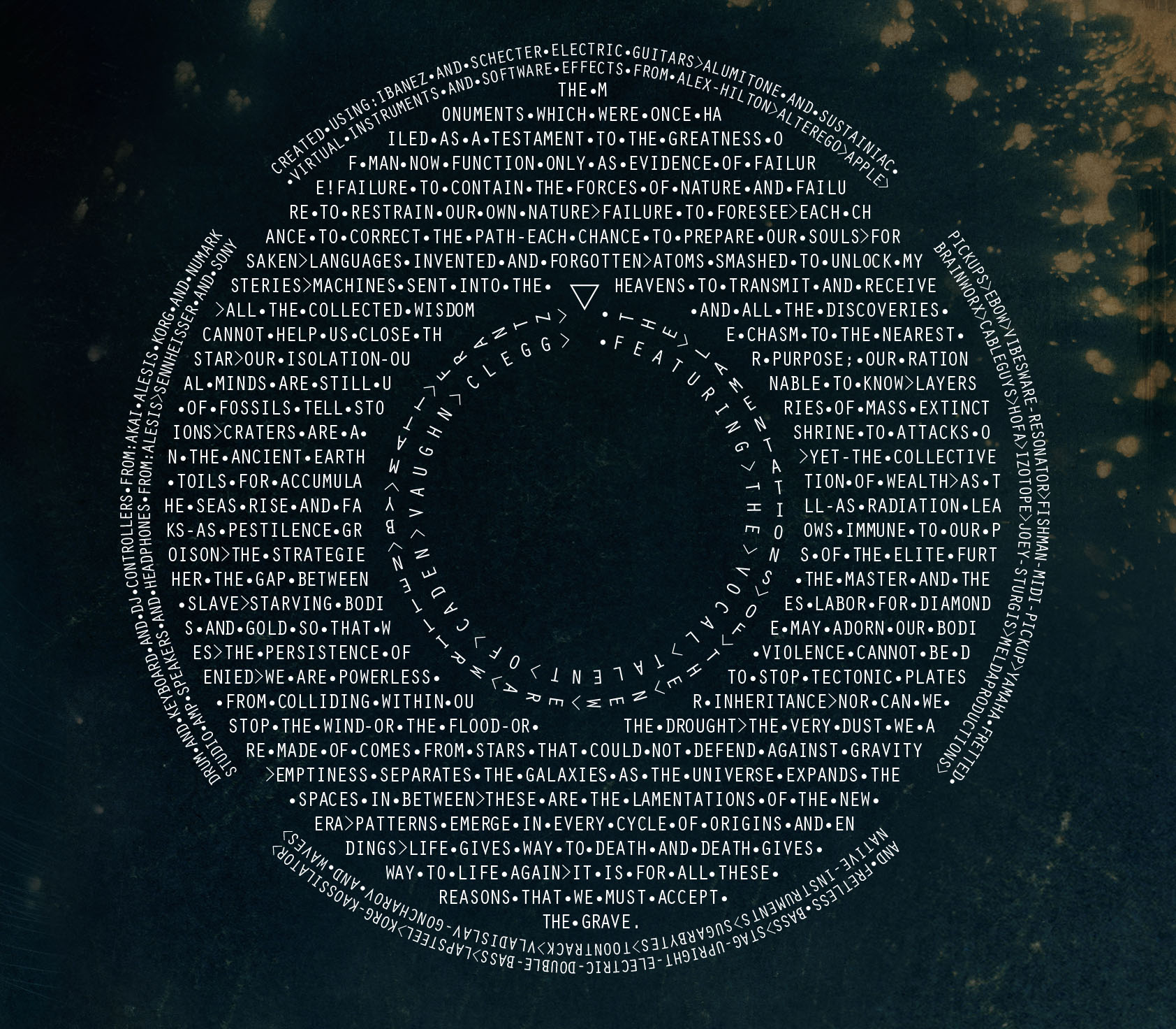
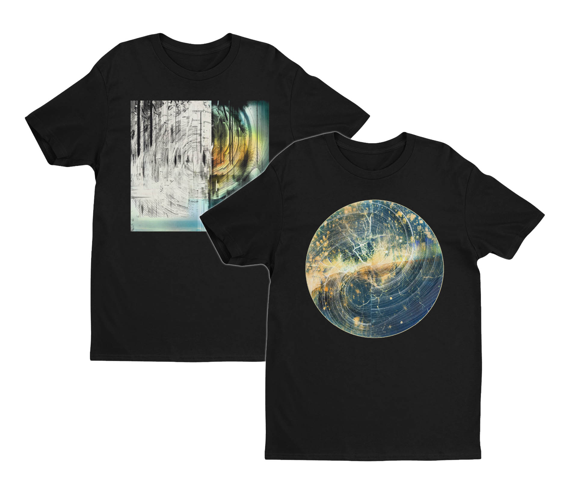
Graphic design by Matt Frantz, space photography by NASA.
Art and design by Matt Frantz
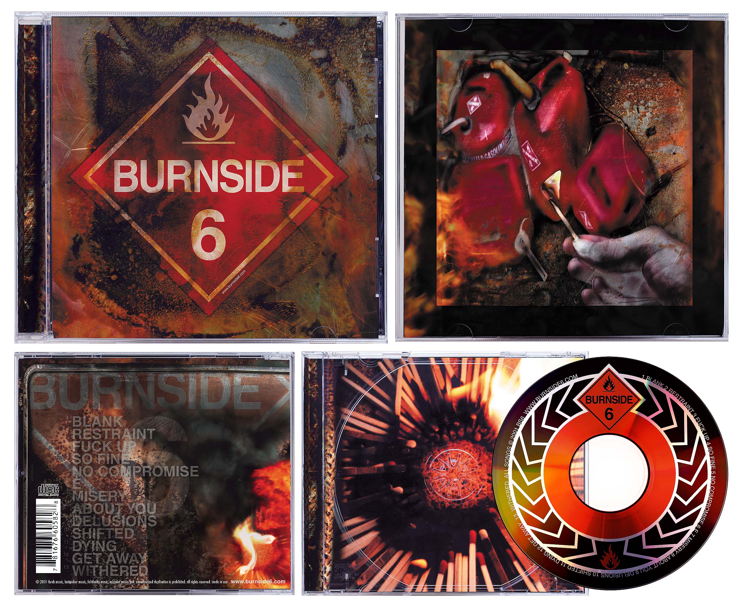
Burnside 6 CD art and design by Matt Frantz
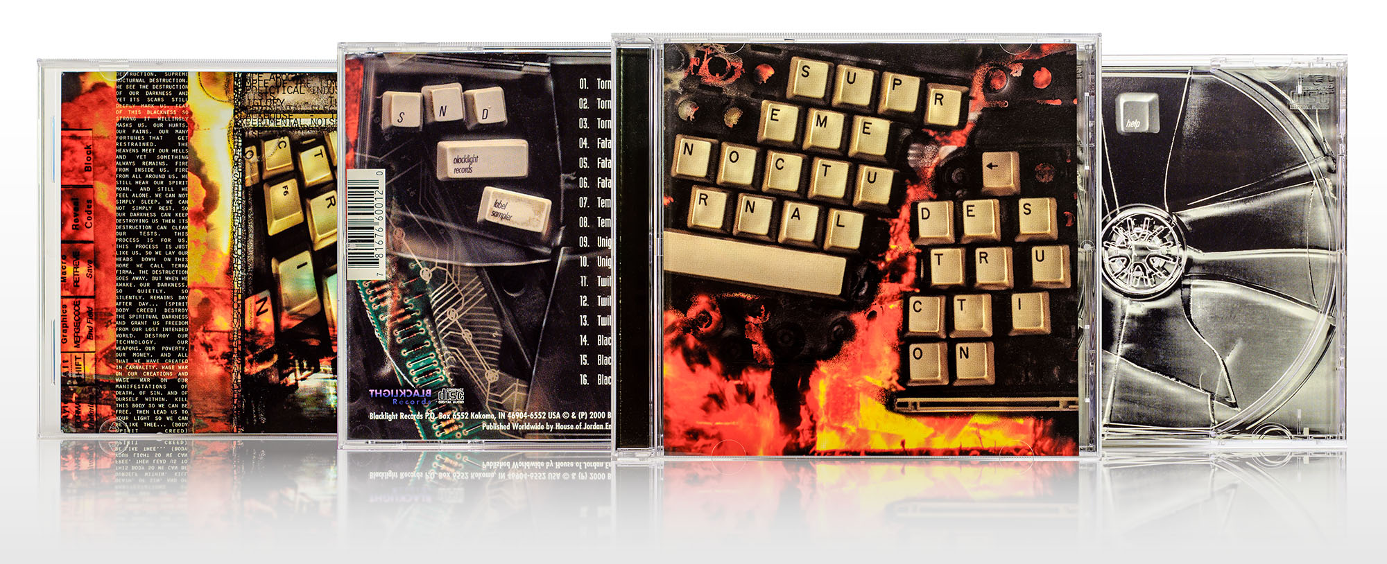
Supreme Nocturnal Destruction design, imagery, and prepress
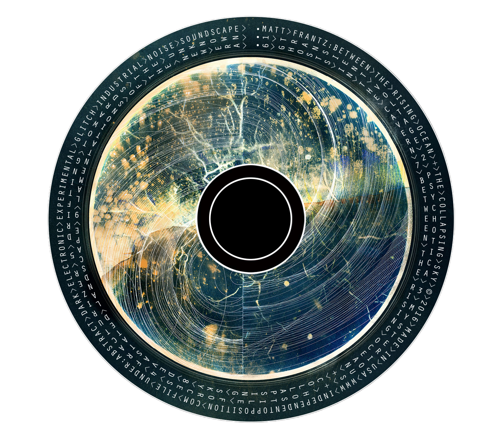
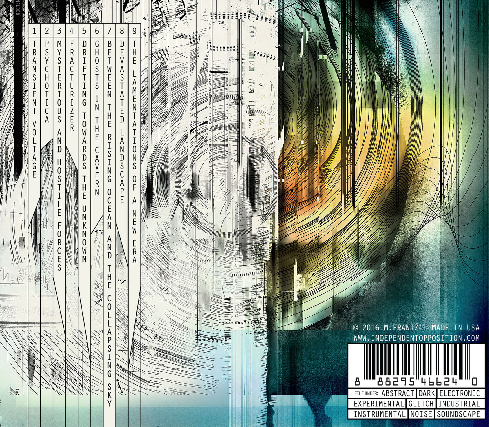
Process: CD Cover Imagery
As a designer, I reject the notion of being merely a mixer of existing elements supplied by stock companies (or AI). Instead, I think of what I can create, and that is how I tap into motivation. This is especially true when it comes to imagery for music, literature, and entertainment. My process isn’t simply an application of steps and rules, but of discovery. Efficiency is far less important than engagement with imagination.
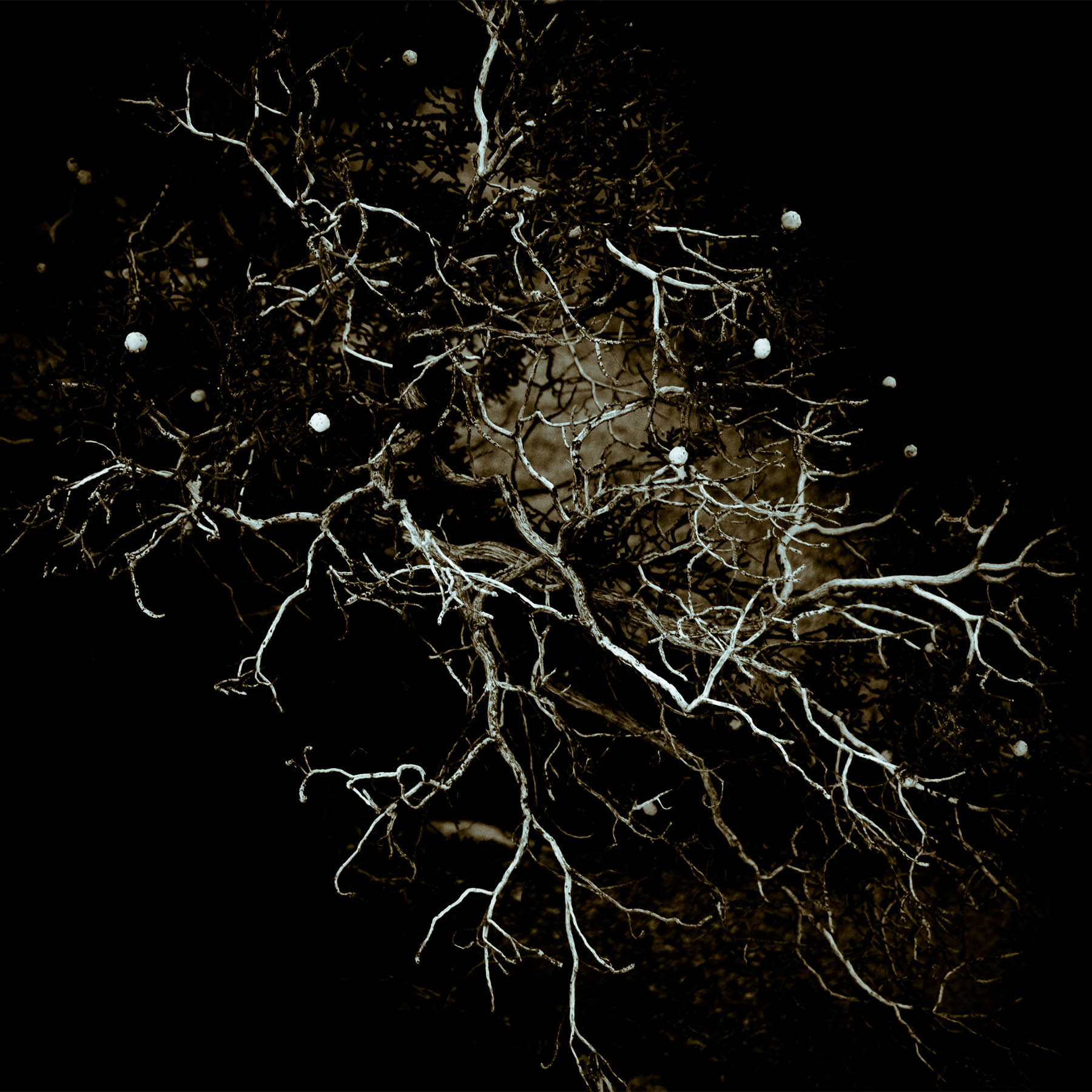
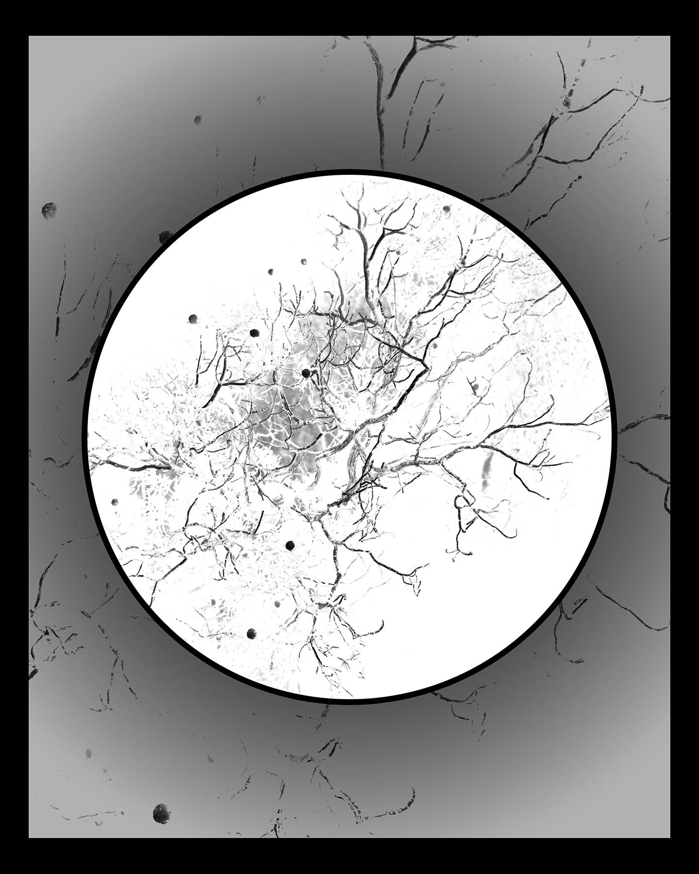
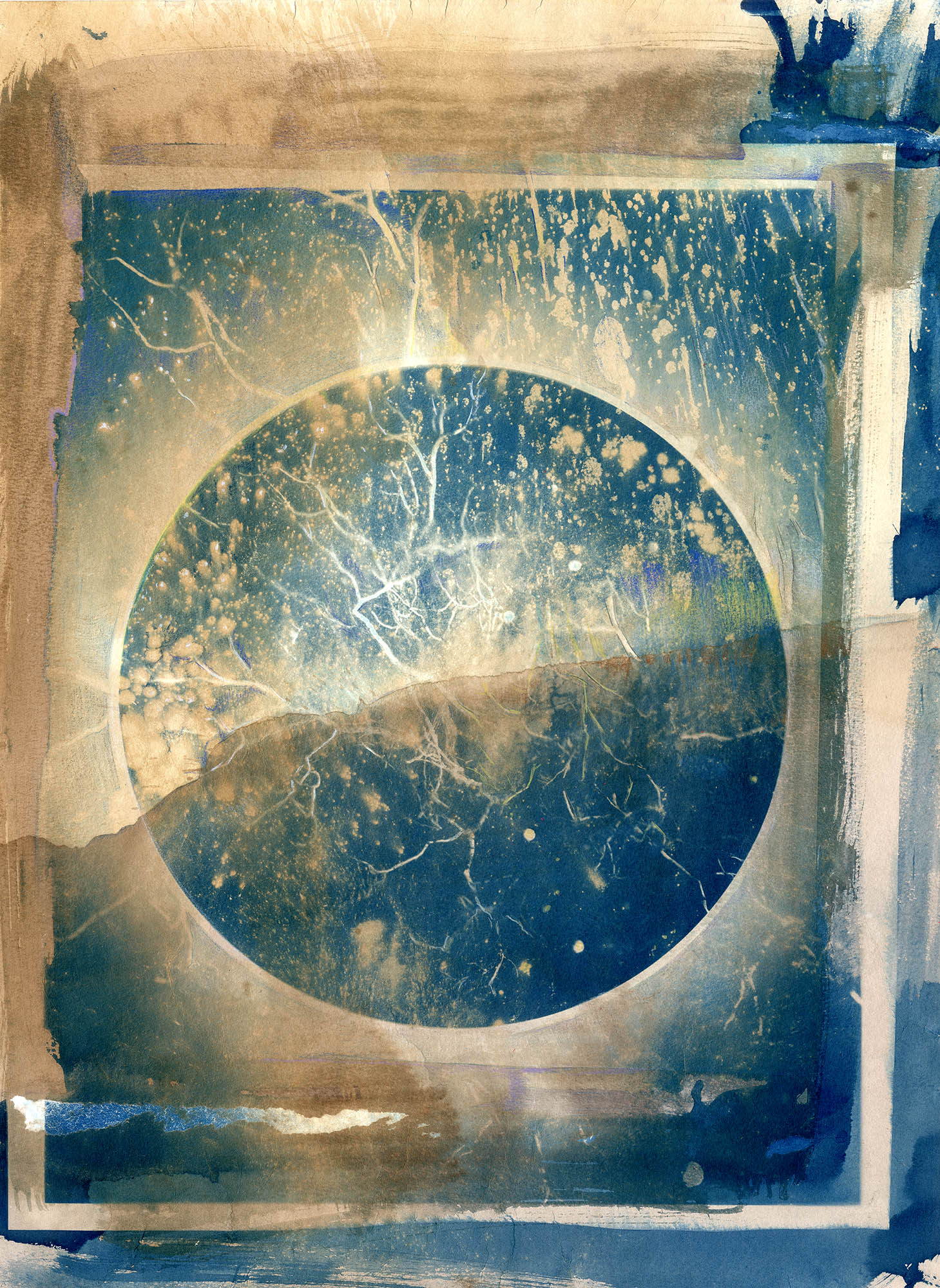
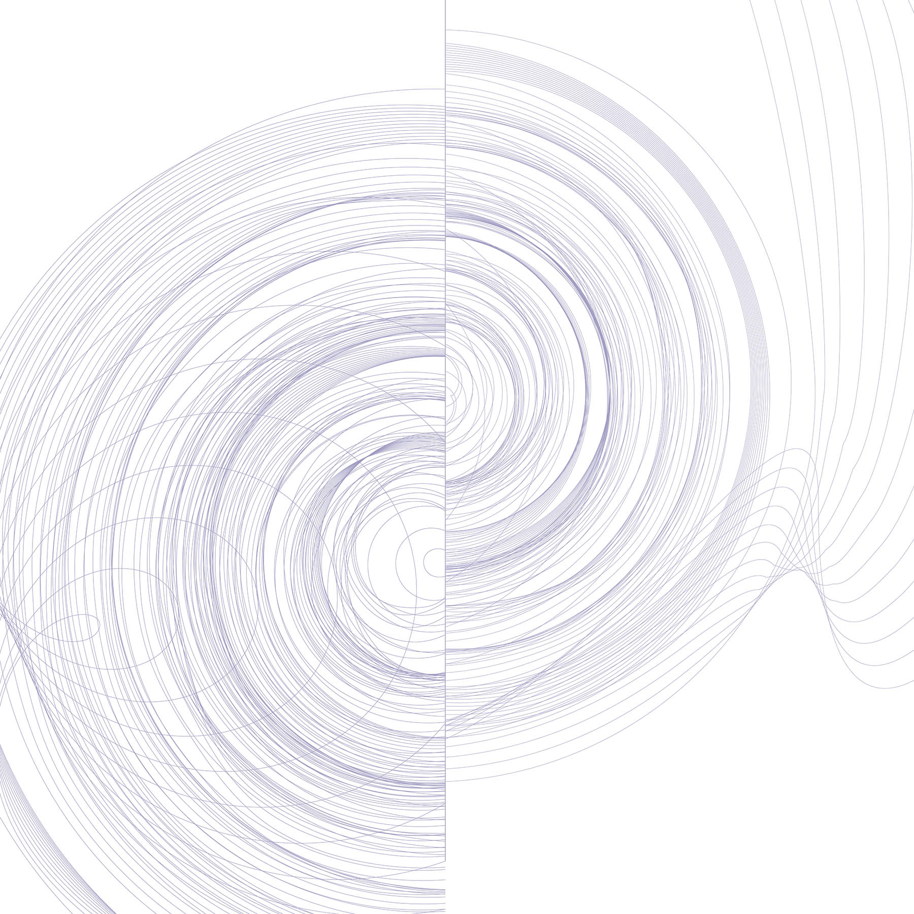
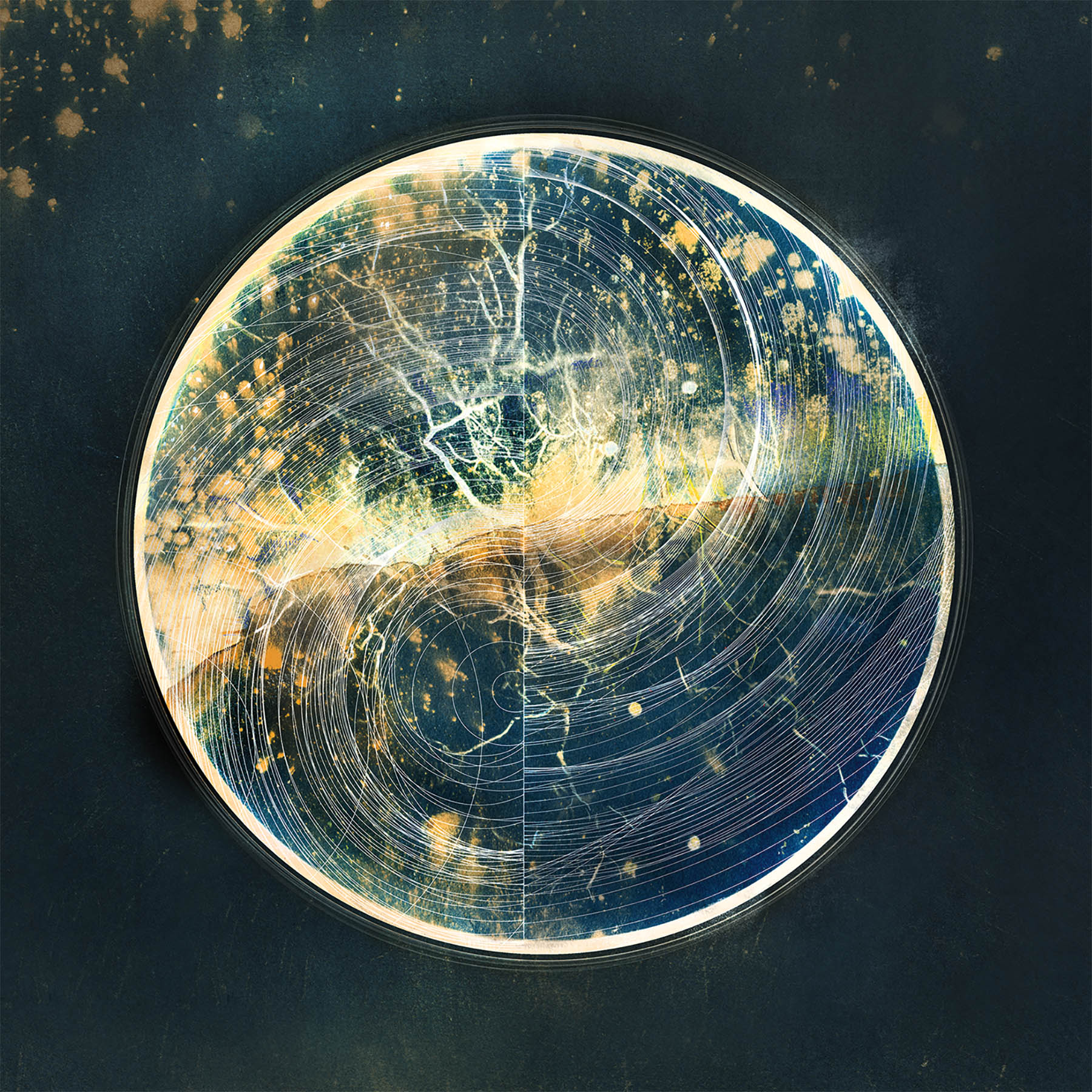
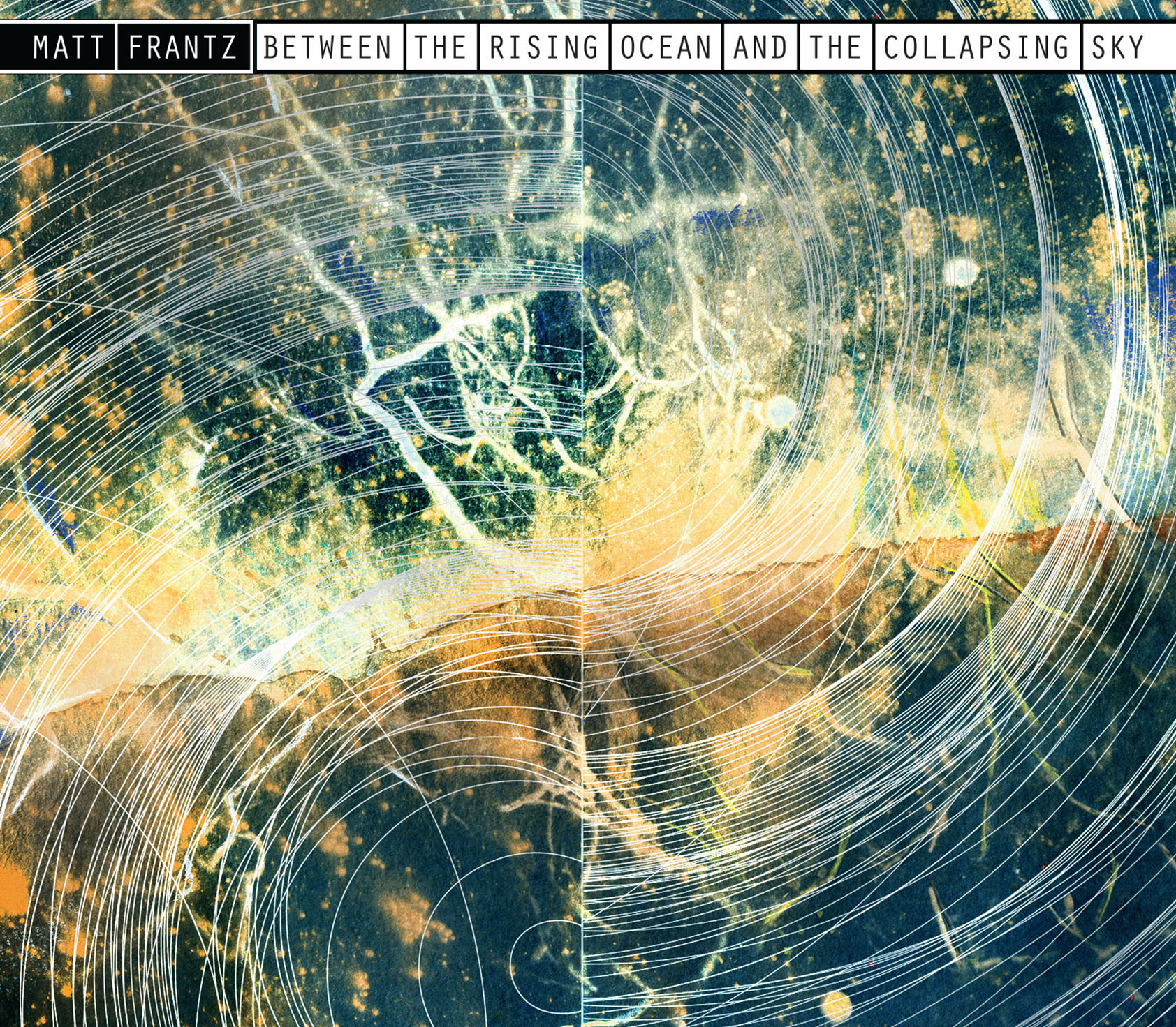
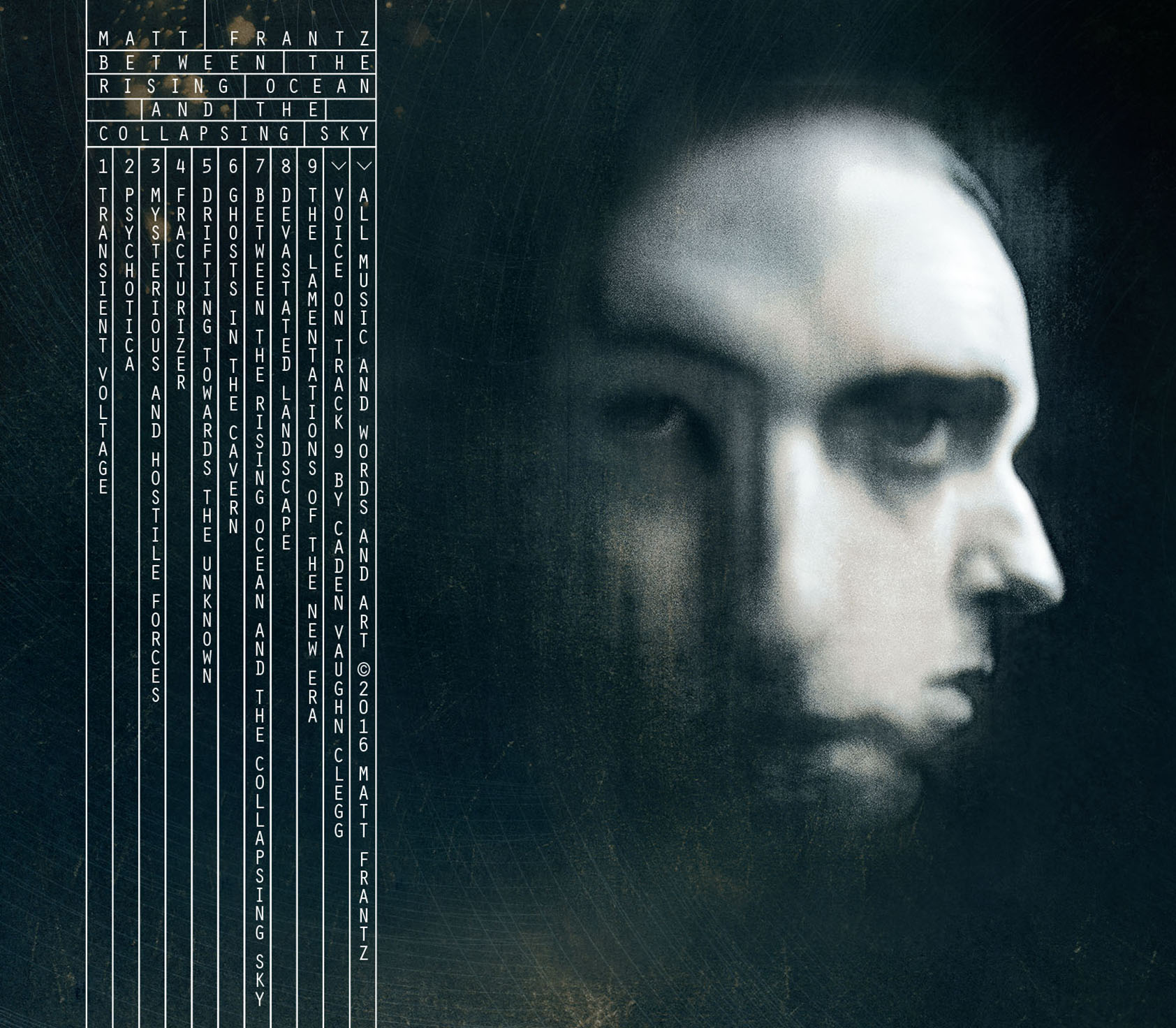
The images above show the evolution of the cover and disc graphics for Between the Rising Ocean and the Collapsing Sky. 1. Photograph I took at Joshua Tree National Park. 2. Digital prep an inversion for nagative transparency needed for cyanotype photo developing. 3. Developed cyanotyp on watercolor paper with toner and colored pencil. 4. Vector spiral lines. 5. Final composite ready for typography.
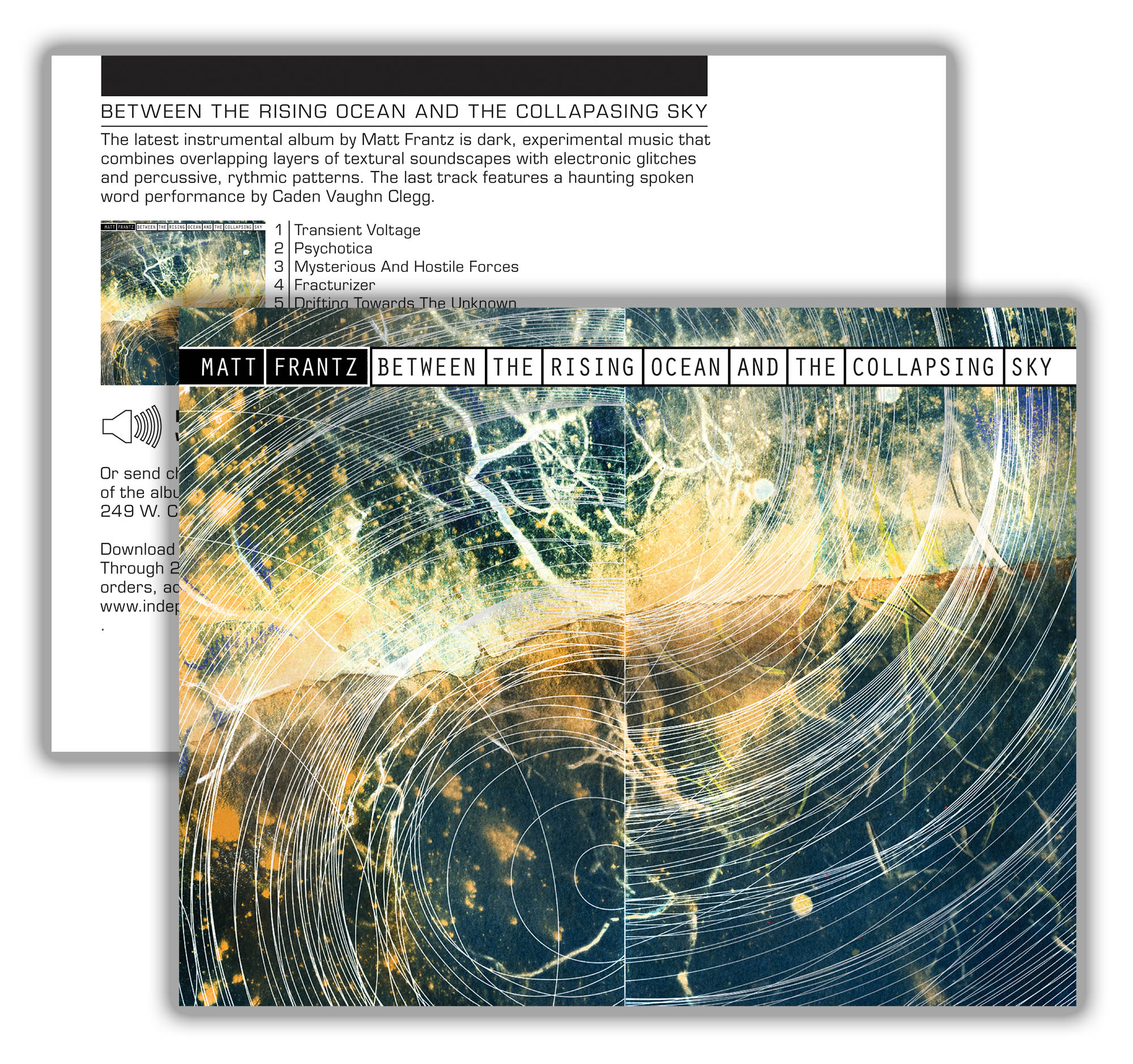
The images below show the designed layout for the Digipak packaging and marketing materials.
Design, Fabrication, Surface Treatment + Graphics
These are designs I have translated from paper or the digital realm to tangible objects; including musical instruments, effects pedals, and signage.
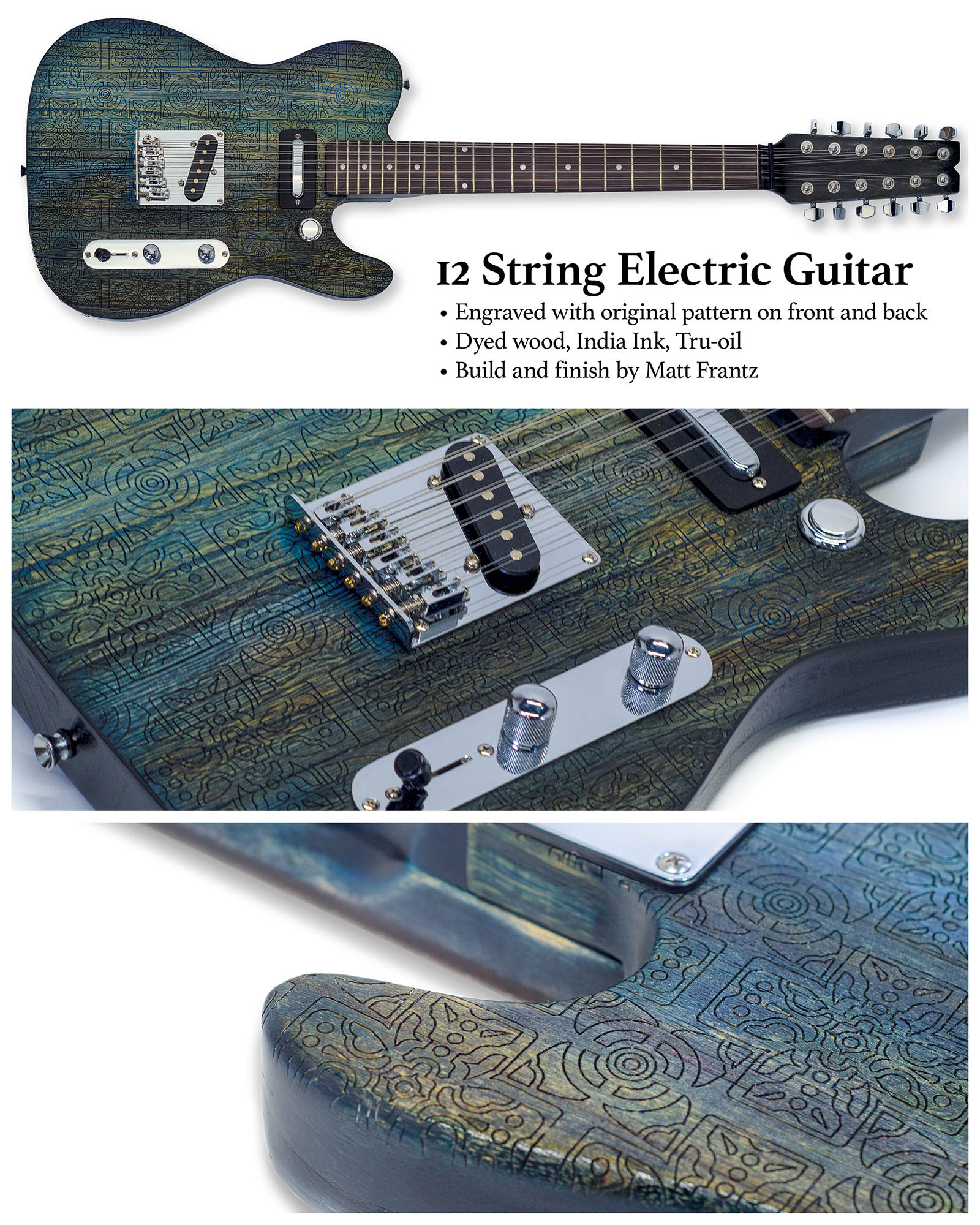
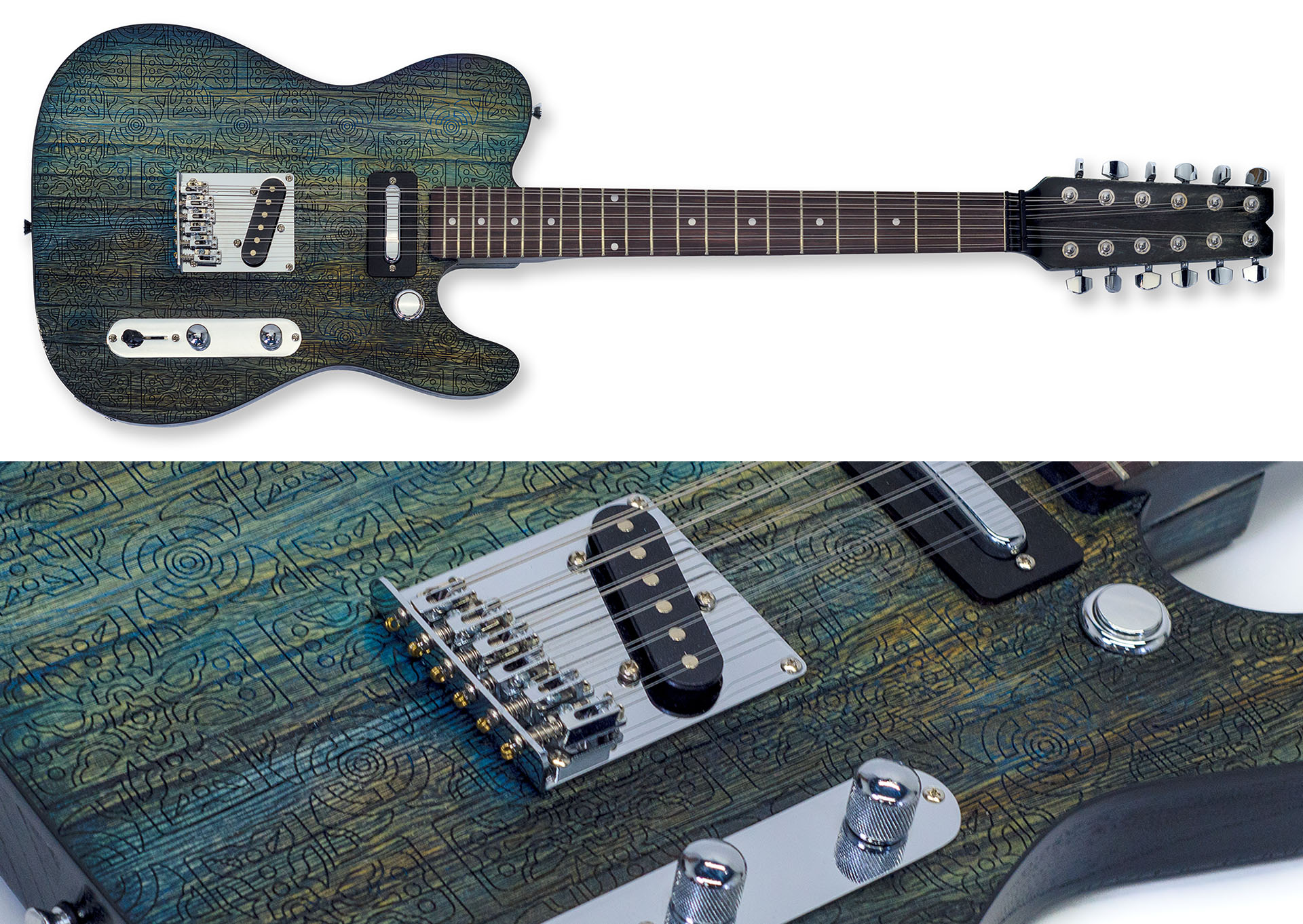
12 string guitar custom build
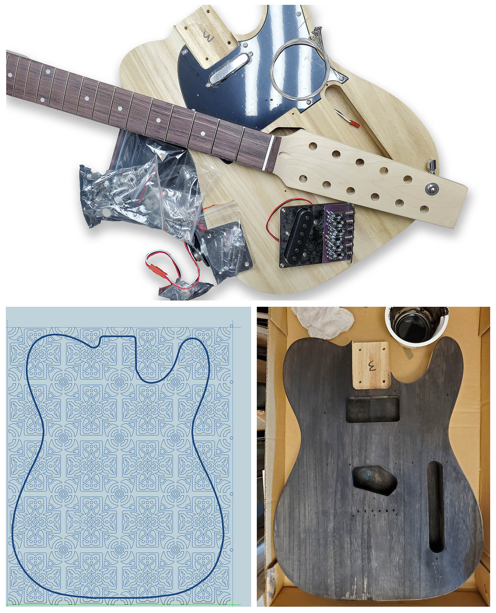
12 string guitar pattern and color process
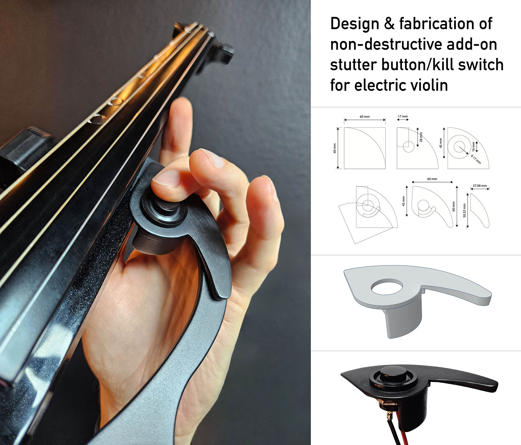
Design & fabrication of electric violin kill switch
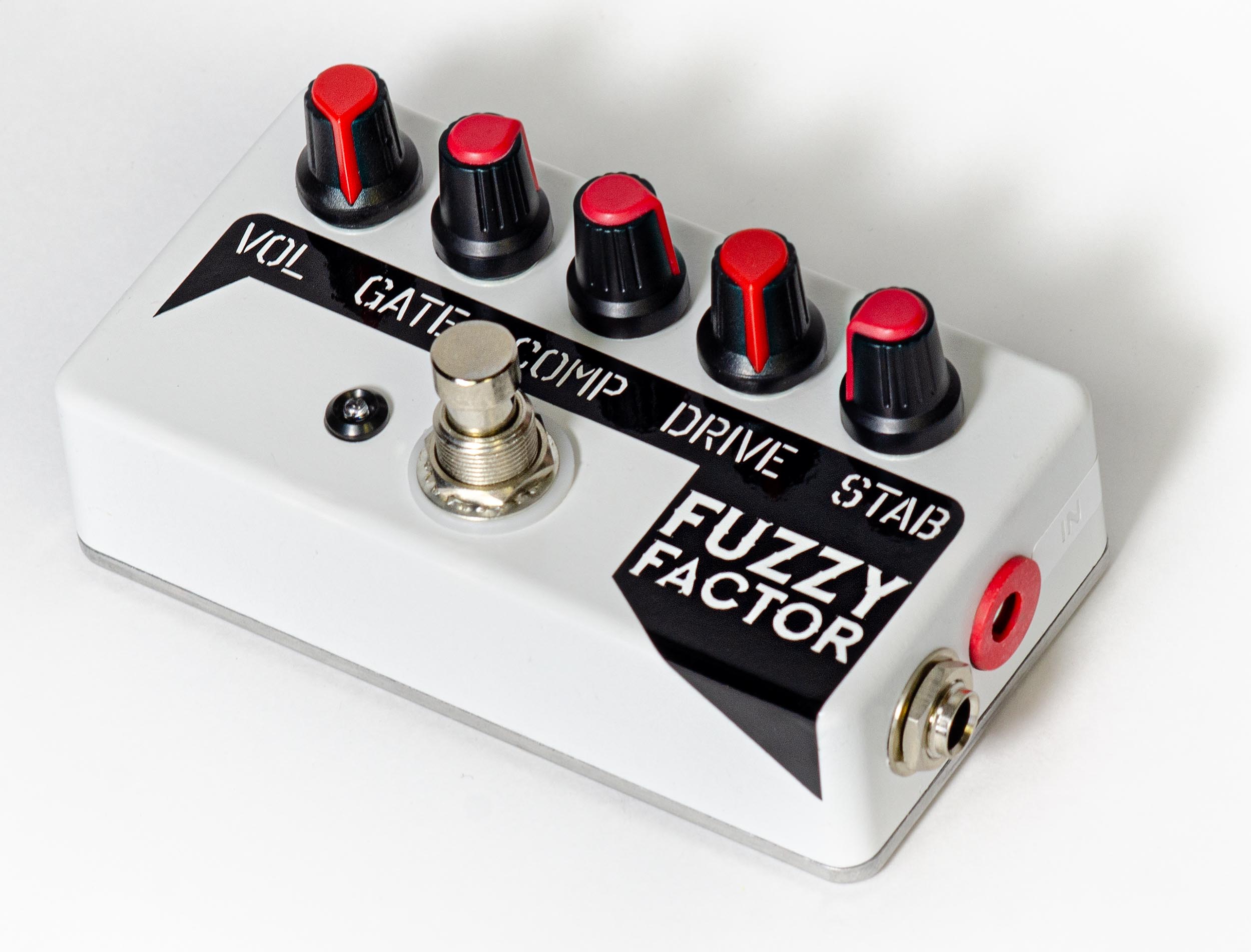
Custom effect pedal enclosure + graphics
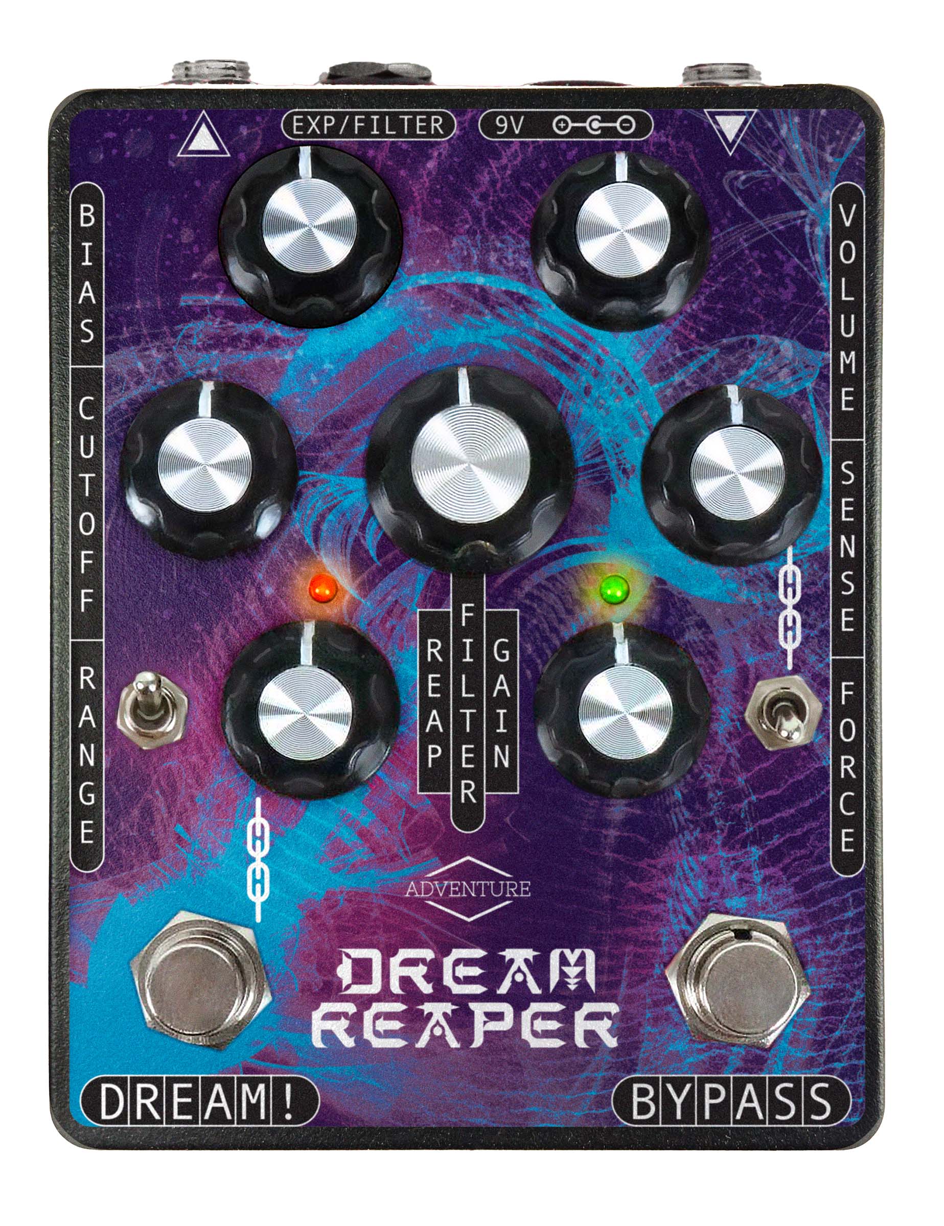
Custom one-off Matt Frantz graphics edition of Dream Reaper effects pedal.
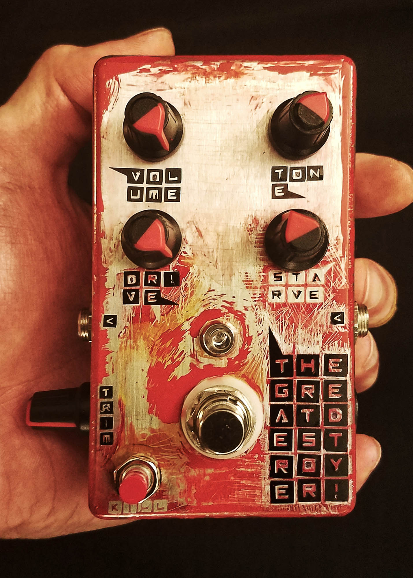
The Great Destroyer custom build + graphics effect pedal
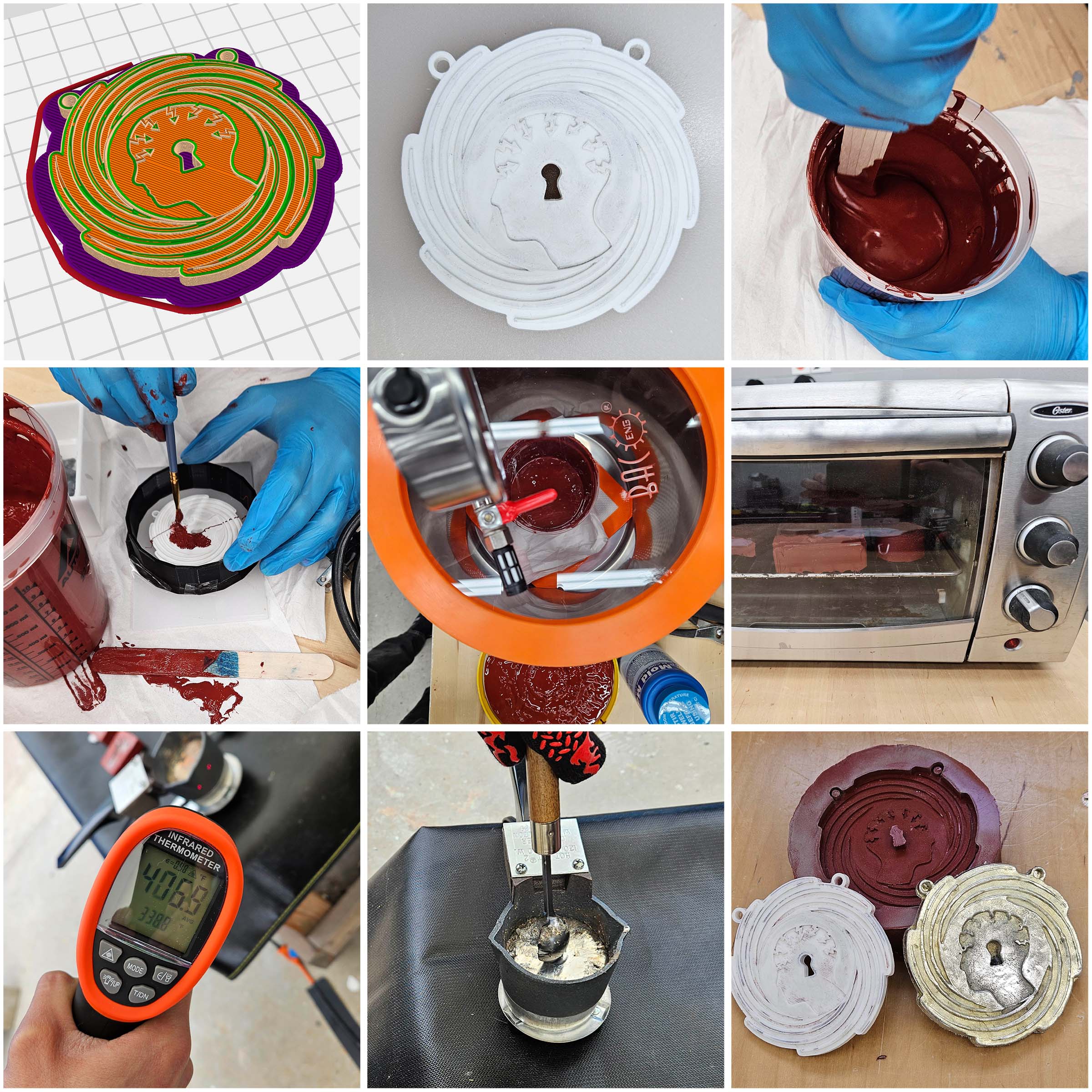
Pewter casting steps: 3D print, mold making, melting and pouring metal
Design provided by client, my role was fabrication and paint.
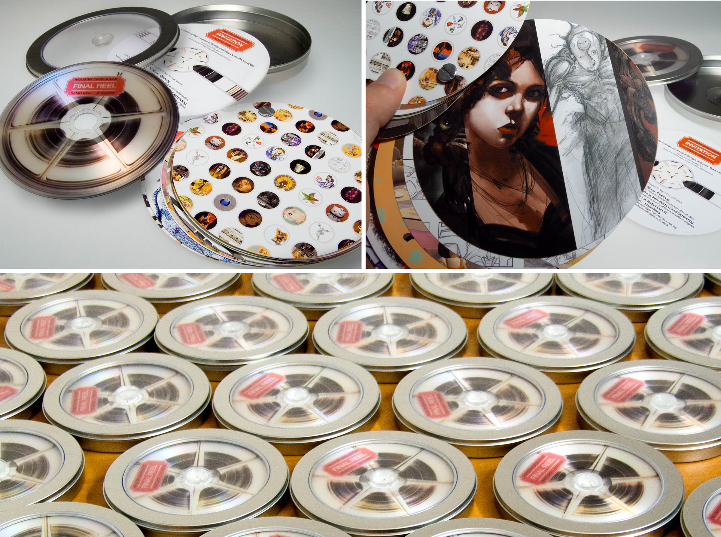
Design and production of promotional DVD “reel” package featuring artists and animators.
Content © by M. Frantz. All rights reserved.